Happy Wednesday! Today I have a fun card using the Happy Place stamp set which I used in a previous post. For the card in that post, I used sponge daubers and applied ink directly onto the stamp. Today I have a different technique that I had to trouble shoot to get the best result. I will show you the differences in the outcome. So let’s get to it!
To make the card base, I cut a piece of Melon Mambo cardstock to 4¼” x 11” on my Paper Trimmer, scored and folded at 5½”, and burnished with my Bone Folder. I cut a piece of Basic Gray cardstock to 4″ x 5¼”. I cut two pieces of Basic White cardstock to 4¼” x 5½” and one to 4″ x 5¼”. I will be cutting this piece down to 3⅞” x 5⅛” after stamping.
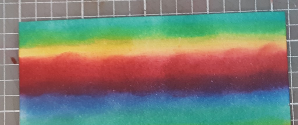
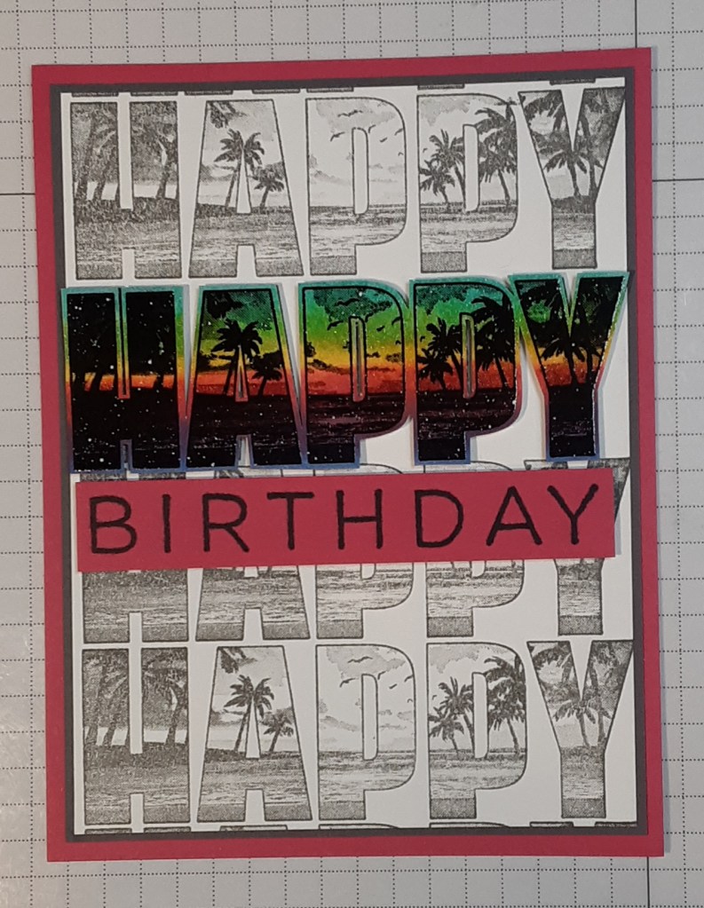
With the first piece of white cardstock, I used a Sponge Dauber to apply ink to the paper. I began with Coastal Cabana ink and made a line of ink across the 4¼” edge. I made the line about ½” wide. I added some Daffodil Delight ink under the Coastal Cabana, overlapping and blending it a little.
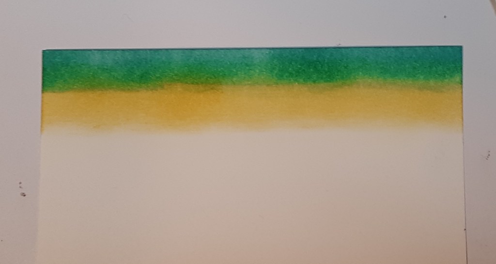
Next, I applied Melon Mambo ink, overlapping a little and blending. Under that I added Azure Afternoon ink. These colors gave it a rainbow effect. You can see the shape of the dauber, especially in the Melon Mambo, but not to worry. It evened out in the end.
I wanted to heat emboss Happy on this colorful strip. I set this aside while the ink dried. In the meantime, let me tell you what I learned. Initially, I heat embossed the stamped image with clear embossing powder from the Basics Embossing Powder pack. I used Versafine Black Onyx ink, which Stampin’ Up! carried once upon a time. This is a pigment ink that takes a little time to dry so the embossing powder likes to stick to it. The clear embossing powder sticks to the black ink and the extra bits don’t show and blur the image. You could use Versamark ink and black embossing powder, but I haven’t had any level of success with it. I always seem to manage to get the black embossing powder EVERYWHERE and it is a mess. Anyway, I applied the ink to the stamped and embossed image. Because I embossed the image first, the ink didn’t stick everywhere on the paper beneath it and the inking was subtle. There were spots that could have had color without the embossing. Here is a picture showing the comparison of embossing first versus inking first. When I inked first, the colors were more vibrant.
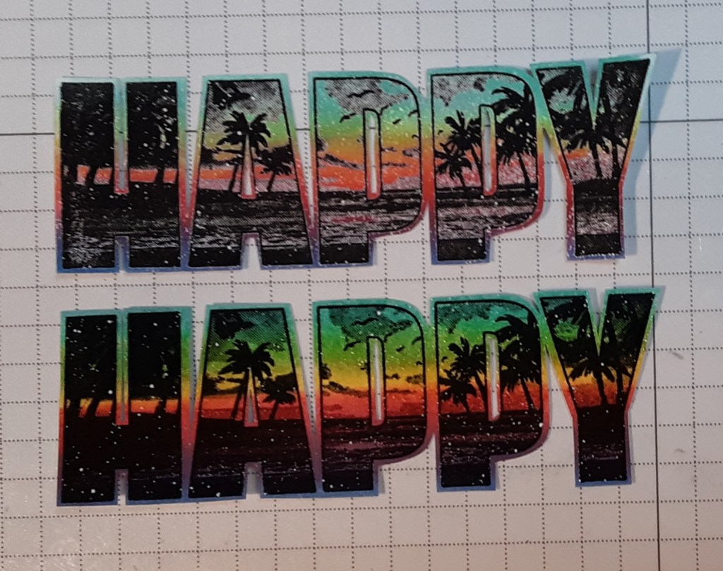
So, once my ink was dry, I used anti-static powder just in case the ink wasn’t completely dry. I used my Versafine Black Onyx ink and applied my embossing powder. I set the image with my Heat Tool. I fussy cut my sentiment, making sure I left the letters somewhat connected. I did use an exacto knife to cut out the insides of the letters which was probably unnecessary.
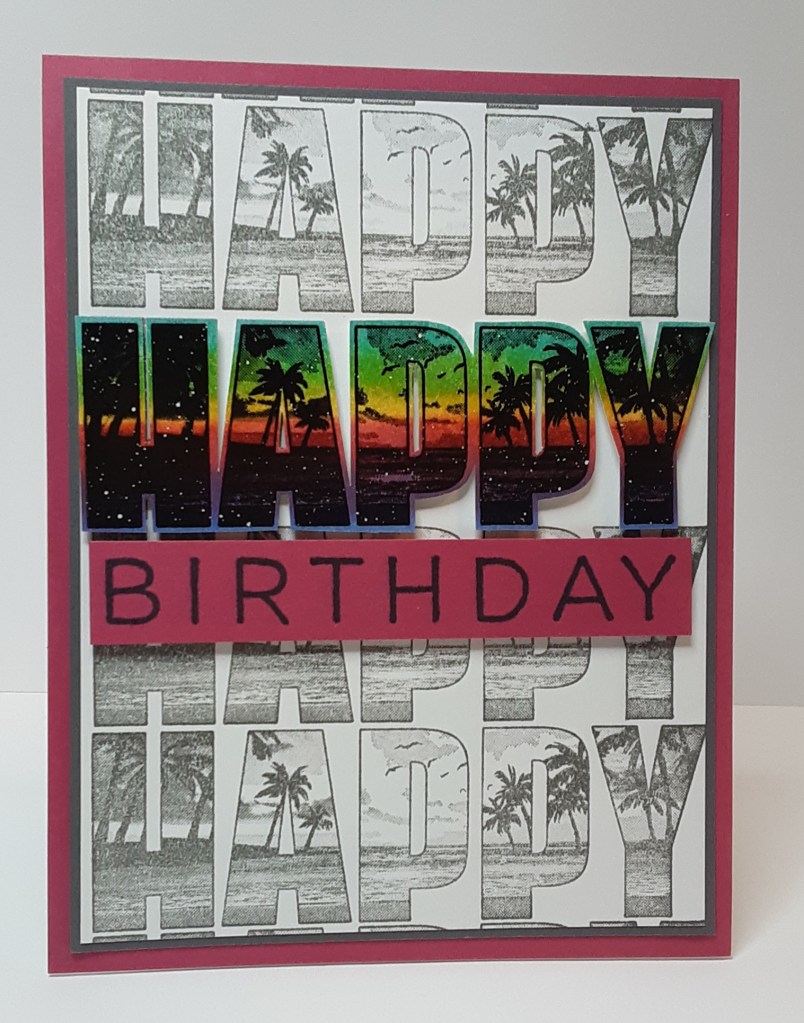
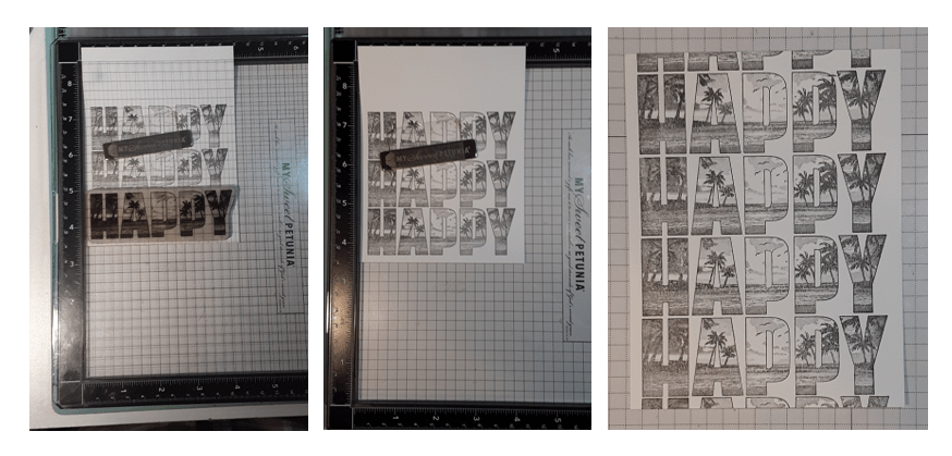
For my background panel, I repeat stamped the Happy with Smoky Slate ink on my second piece of white cardstock. I recommend using a stamping tool like the MISTI to make this easier. I positioned my paper and moved it up and down the side 1¼”. I trimmed the background down to 3⅞” x 5⅛”.
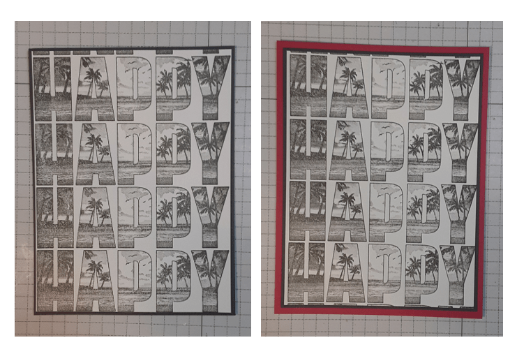
I adhered my stamped panel to my mat with my favorite adhesive (Multipurpose Liquid Glue or Stampin’ Seal). I like the way the gray frames the stamped panel. I adhered this to my card base.
With Stampin’ Dimensionals, I adhered Happy on top of one of the previously stamped words on the card using the spotlight technique.
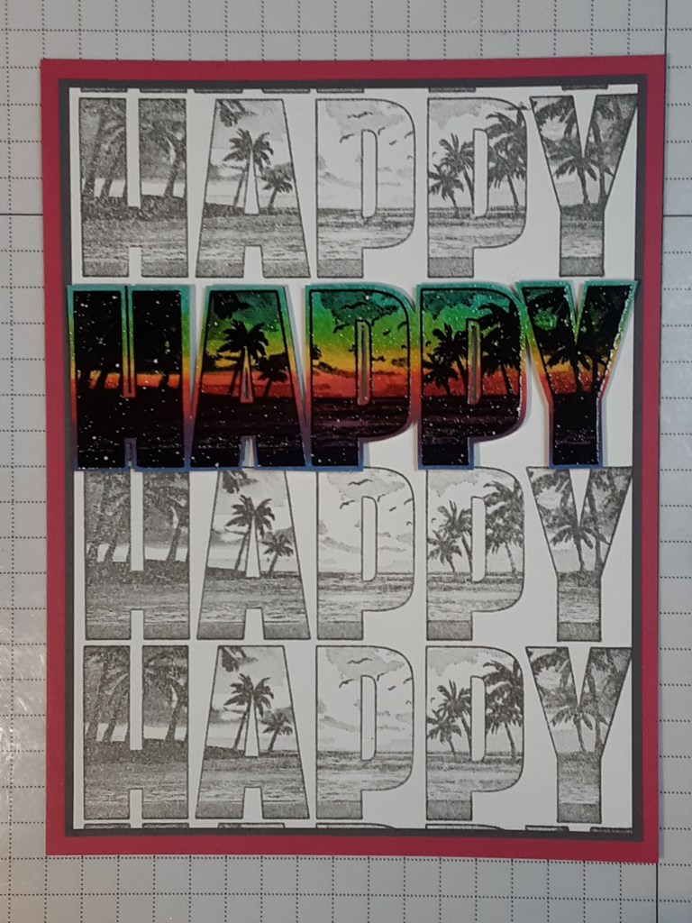
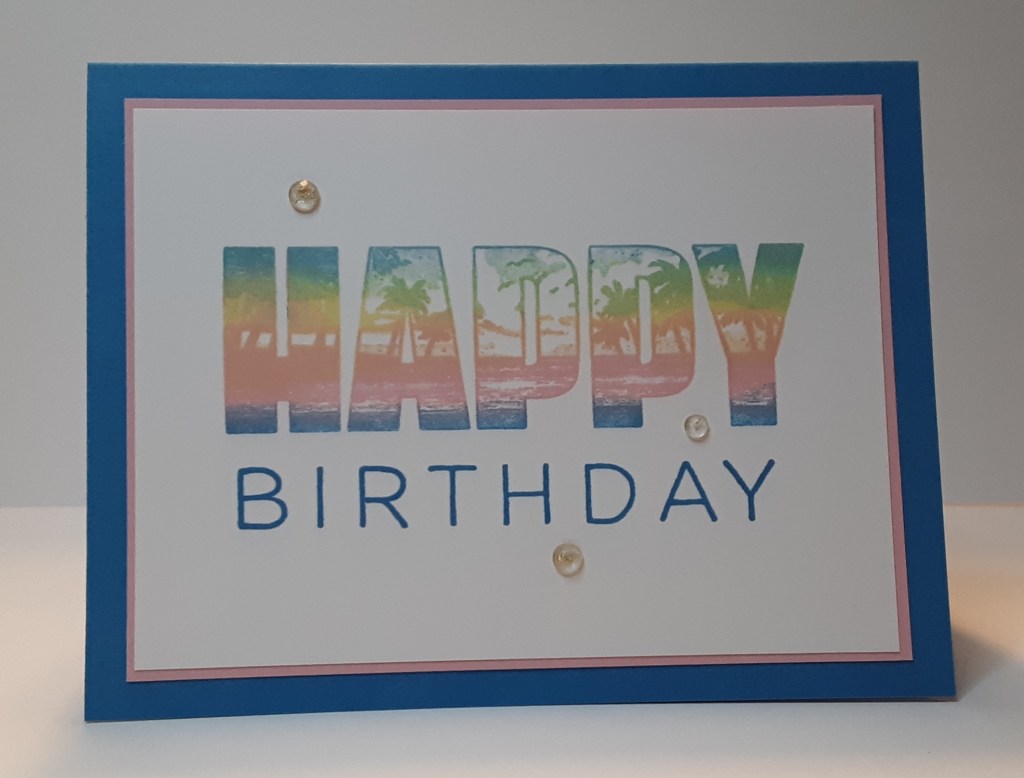
This stamp set has several different sentiments to pair the Happy with. For this card, I chose Birthday. This would also be a perfect card for retirement. I stamped Birthday in Momento Tuxedo Black ink on a scrap of Melon Mambo cardstock. I trimmed it down and adhered it to the card with Stampin’ Dimensionals. You could also add some sparkly gems to the card, though I didn’t on this one. I didn’t want to detract from the shine provided by the heat embossing.
To finish the card, I stamped a greeting on the third piece of white cardstock and glued it inside my card.
I hope you liked this card!
For the complete supply list, click here.
Further inspiration: