
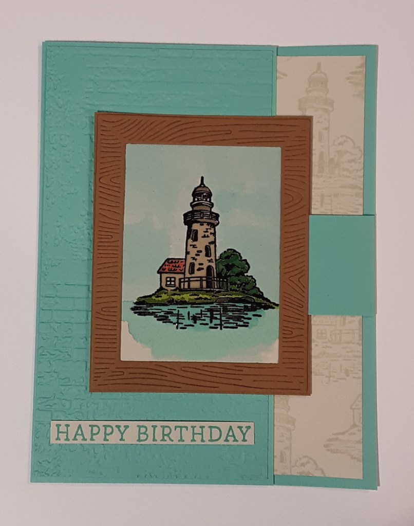
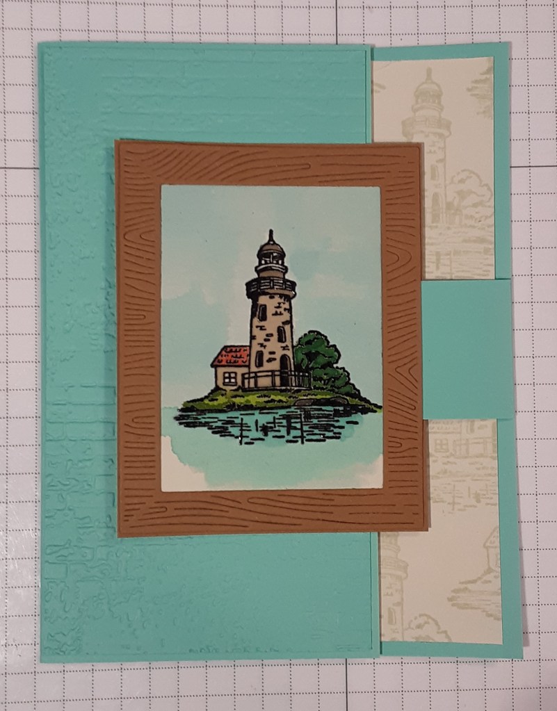
Today I thought I would try something new. I’ve water colored with Stampin’ Up! ink pads before, but usually just as a wash. Today I decided to try coloring in an image. I chose the lighthouse image from Framed Scenes stamp set because it has detailed, drawn lines without a lot of shading. Plus, the image is small and manageable. In addition to the water coloring, I added a fun fold! Marilyn here with another card. Also, don’t forget to take advantage of the June Stampin’ Up! promotion, buy one suite or suite item and get one for 50% off. Less than a week left to stock up on DSP or bundles.
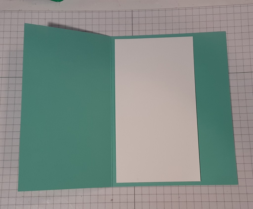
To make the card base, I cut a piece of Coastal Cabana cardstock to 5-1/2″ x 7-1/4″ on my Paper Trimmer, scored and folded at 4-1/4″, and burnished with my Bone Folder. With the 1-1/4″ strip of Coastal Cabana cardstock, I cut it to 1-1/4″ x 3-1/2″ and scored at 2-1/2″. Next, I cut an additional piece of Coastal Cabana cardstock to 5-3/8″ x 2-7/8″. I ran this piece through my Exposed Brick Embossing Folder on my Stampin’ Cut & Emboss Machine. This is a 3D embossing folder, so I used my base plate and the gray plate with the embossing folder sandwiched between. I cut a piece of Pecan Pie cardstock to 2-3/4″ x 3-1/2″. With another piece of Pecan Pie cardstock, I die cut the rectangular frame from the Framed Scenes dies in the Framed Scenes bundle. This is a delicate die cut. I cut a piece of Basic Beige cardstock to 2-1/2″ x 3-1/4″ and another to 1-1/4″ x 5-1/4″. I cut a piece of Basic White cardstock to 5-1/4″ x 2-7/8″.
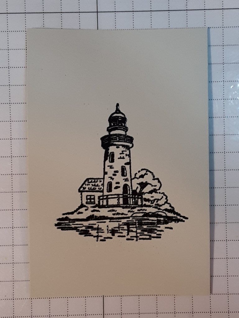
With the Framed Scenes bundle, I stamped the lighthouse image with Versamark ink on the Basic Beige rectangle (I used anti-static powder first), centering it. I sprinkled on Black Embossing Powder and heat set it with my Heat Tool. The raised embossing helps confine the watercolor ink. You could also use a Versafine black ink pad and emboss with clear embossing powder.
To begin my water coloring, I applied ink to my largest acrylic block (Clear Block F) by tapping my Balmy Blue ink pad on my block. With a #2 round paint brush I added water to the ink. I used an inexpensive brush from a pack of brushes I got from my favorite hobby store. I tested the intensity of the color on a scrap of Basic Beige cardstock. When I was satisfied with the color, I was ready to paint.
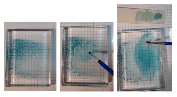
I painted the sky first with the Balmy Blue ink. I outlined the image and then brushed out from it. I picked up more ink as I needed it and also added more water to my block as I needed it. As an aside, I actually made enough for eight cards. I painted one step on all eight panels, so I didn’t have to constantly change ink colors in between. To keep the panels from warping, I put them under something flat and heavy while I worked on the next one. Since I had embossed the image, I didn’t use my heat tool in case it scorched my embossing.
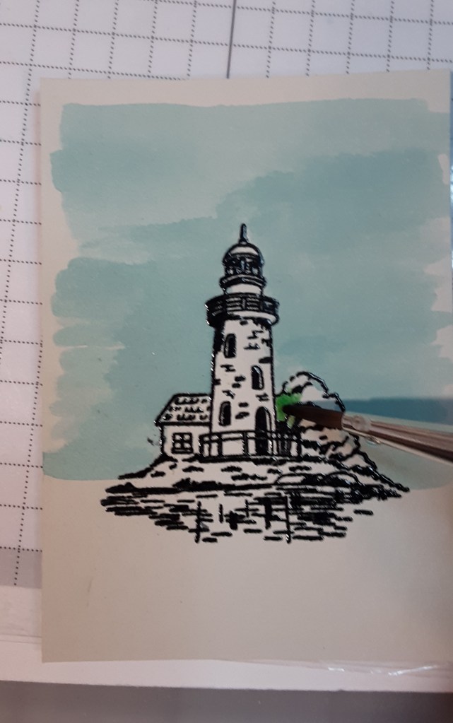
I painted the trees next with Garden Green ink. I did a test on my scrap of Basic Beige cardstock. I found that the cardstock was quite absorbent, and the color lightened as it dried. I added some more intense color (less water) to act as shading along the lines in the trees.
I rinsed off my block and used a bit of Cajun Craze ink for the roof on the little side addition to the lighthouse.
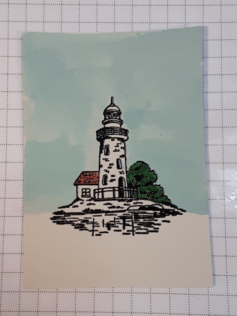
I used Crumb Cake ink for the lighthouse. I used more water with the ink for the building and used more intense (less water) for the top part and the shadows in the windows.
I used Gray Granite ink for the rocks.
I used Granny Apple Green ink for the grassy area in front of the lighthouse.
Finally, I used Coastal Cabana ink for water. I put down a light coat and went back in with ink with less water to highlight the stamped part of the water.
If you choose to forego the water coloring and stick with Stampin’ Blends, make sure you use Momento Tuxedo Black ink instead of embossing the image. Blends and embossing are not great friends.
I carefully used my tape runner (Stampin’ Seal) around the frame. If I used wet glue (Multipurpose Liquid Glue), it would ooze through all the cuts made from the die on the frame and create a sticky mess. I adhered the frame to my colored image.
I adhered my dry embossed panel to the front of my card. There was a narrow border. If you prefer, you can skip this part and emboss the front of the card instead. I personally prefer the sturdiness of the added panel.
The next step was to adhere the Basic White piece inside the card. If you want to add a sentiment, you should stamp that before adhering inside. You should have 1/8″ border except on the right.
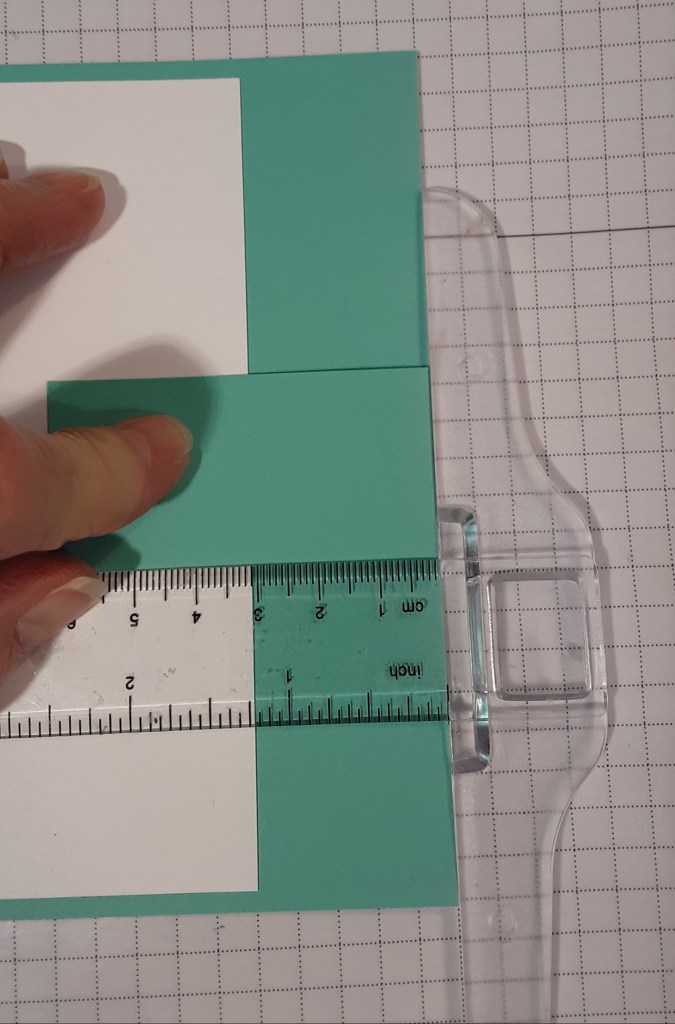
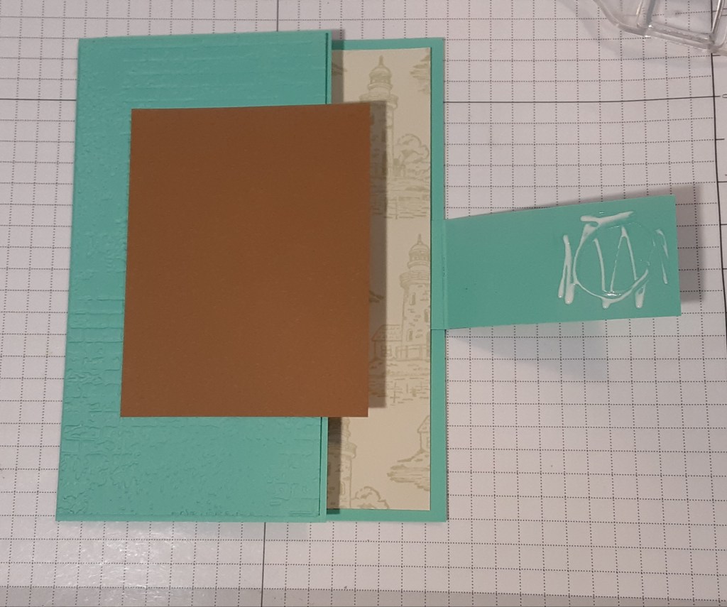
Next, I added the flap piece, which is the 3-1/2″ x 1-1/4″ strip. I folded it on the score line and added glue to the short side. I lined the fold up with the right edge of my card. I tend to be a perfectionist, so, of course, I got out my grid paper and t-ruler. You can eyeball it if you want. In the picture, my finger is holding down the part that DOES NOT have glue on it.
Next, I stamped the lighthouse on my Basic Beige strip with Basic Beige ink for a tone on tone look. I glued this to the right inside of my card. I lined up my edges for a uniform look.
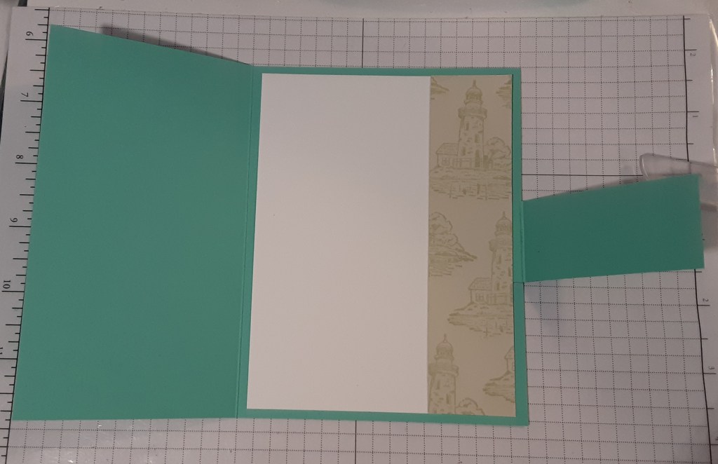
I closed the card and positioned my extra Pecan Pie piece in the middle of the front. Because the frame was so delicate (and sticky), I wanted to back it with another piece of cardstock. I added some glue to the part of the flap that overlapped the Pecan Pie piece.
I folded the flap back onto the Pecan Pie piece. (Sorry the picture is a little fuzzy. I’m sure it was my phone’s fault. You get the gist.)
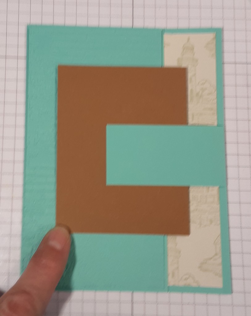
I added glue to my focal panel and adhered it. This sandwiches the flap ends between two panels and gives a more finished look.
I stamped Happy Birthday from Simply Said stamp set in Coastal Cabana ink and cut close to the words for 1/4″ x 2-1/2″. I adhered this to my card. This stamp set has Thinking of You and Thank You in the same font which you could easily substitute.
Just to prove I am an amateur water colorist, I’ve included a comparison photo of two of my colored panels. In the one on the right, I couldn’t leave well enough alone and had to add more color. I had left a bit of a border around the image on the right. I added color after it dried and made a mess. You can see the water line where I kept adding water to try and blend it out. I think I needed to take the water all the way to the edge of the paper. As you can see, I did get better with some practice. Also, I used cardstock. You would get a different result if you used watercolor paper. I didn’t want my cardstock to pill by adding too much water.

I hope you liked this card and enjoyed learning from my mistakes!
For the complete supply list, click here.
